

Here at Cotidia, we thoroughly enjoy the moment when net magazine lands on our doorstep each month. It’s a source of inspiration, knowledge and generally ticks the boxes for all things web and beyond. This month is even more exciting, as we turn to page 48 to find my entry to the Design Challenge.
The net magazine design challenge sees 3 designers take on a brief for a brand & website design. Each entrant explains the reasons behind their design choices, as well as any functionality that should be noted and also gives a little info on their month too.
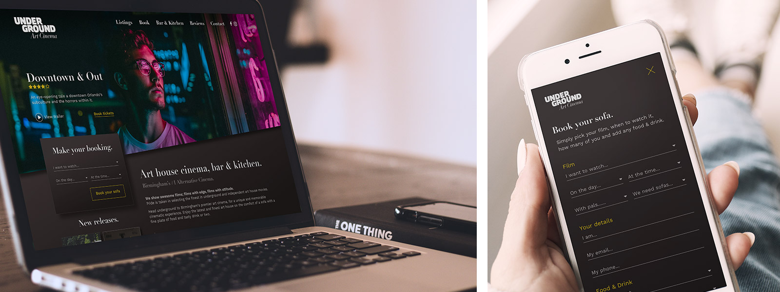
This month’s design challenge is to create a fictional brand for an art house cinema and design the website for said picture house. An exciting brief, with enough info to guide me, yet enough of room for creative freedom and plenty of ideas.
An underground brand
After a fair amount of research into art house cinema, the history of it and of course the films, names and cinemas associated with it, I started the challenge by creating a brand. I settled with the name “Underground Art Cinema”, as the cinema will be showing films of an underground nature.
Underground Art Cinema is a stylish alternative to traditional cinemas, specialising in art house films in a comfy and edgy underground setting, with the inclusion of a licensed bar and kitchen.
This name also links in with the idea of using a space that could be quite central in the city of Birmingham, where an underground space would be ideal,. With windows and daylight not necessary and street-level space being in high demand, going underground seems ideal.
The logo arrangement reflects the steps to the underground cinema, whilst the block font nods to traditional art house films from the 70s. The secondary font, “Didot”, brings an art feel to the design, as well as a classy look stepping away from cinema norms.
Dark and moody
For the website I wanted to create a dark and moody feel that resonates the character of art house films, along with the darkness of cinemas in general. I chose a palette of warm greys, all with a gentle hint of red to add character. Subtle gradients and strong shadows give the page depth and placement and give a solid backdrop for the light greys to stand out in text areas, and occasional use of gold to pinpoint key information or actions.
There are two immediate key areas for the visitor to engage with; the featured film in the hero and the booking form, with the goal of delivering instant info and making it simple for visitors to book.

A cinematic hero
The hero area uses an aspect ratio of 21:9 as used in most cinemas, and is angled along the bottom to again reference going underground, as well as adding a subtle design feature. This area contains information on a featured film*, giving a brief overview of the film along with key CTAs to view the trailer and book tickets. I envisage the content reacting to page scroll on desktop, with the hero area condensing giving more space for the content with the intro content sliding under the hero area as it scrolls too.
(* Yes, you’re right, that isn’t a real film. Hero image credit: @chesterwade / Unsplash).
Clear & simple
The main focus of the website is to deliver information about the cinema and the screenings, as well as to encourage visitors to book. With these thoughts in mind, it was important to keep the experience relatively simple and let the content do the work. I focussed on the booking process as an area of importance, with a booking form that isn’t complicated, and that speaks in a language relevant to the visitor.
As well as an intuitive and simple booking process for the screening, film-goers can also easily pre-order food and drinks for their visit too. There are also ways to invite friends through email or social media, again making things quick and easy for the visitor.
The other entries
I'm quite enjoying the work by Will Ayling (@will__ayling), with his "Mountain Picture House", which uses horizontal scrolling to a good purpose. The site is clean and stylish with a strong and vibrant colour palette.
John Taylor (@JT3000) went for a retro-heavy style for his "Moviedrome" site, focussing on a simple black and white theme which would work well for the more vintage screenings.
You can see the full article in December’s issue of net magazine, which is available in all major news agents.
